12
:
00
:
00
AM
날짜를 불러오는 중…
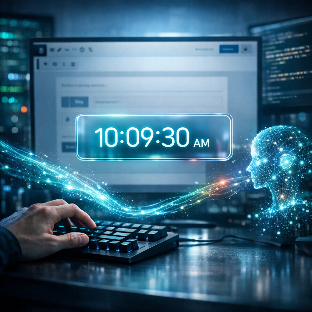
요즘 개발 트렌드인 '바이브 코딩(Vibe Coding)'을 통해 AI와 함께 뚝딱 만들어본 디지털 시계입니다.
무거운 플러그인 설치 없이, 오직 HTML 코드 하나로 블로그에 사이버펑크 감성을 더할 수 있습니다. 반응형으로 제작되어 모바일에서도 예쁘게 빛나는 이 시계를 여러분의 워드프레스에도 적용해 보세요.
네온 글래스모피즘(Neon Glassmorphism) 스타일
코드는 아래와 같습니다.
워드프레스의 Block Editor에서 Custom HTML 에 붙여넣으면 되고, color, font size 등을 변형하면 나만의 멋진 시계를 만들 수 있지요.
<div id="wp-cool-clock-wrapper">
    <div class="clock-container">
        <div class="time-display">
            <span id="clock-hours">12</span>
            <span class="colon">:</span>
            <span id="clock-minutes">00</span>
            <span class="colon">:</span>
            <span id="clock-seconds">00</span>
            <span id="clock-ampm">AM</span>
        </div>
        <div class="date-display" id="clock-date">
            날짜를 불러오는 중...
        </div>
    </div>

    <style>
        /* 폰트 불러오기 (디지털 느낌의 폰트) */
        @import url('https://fonts.googleapis.com/css2?family=Share+Tech+Mono&display=swap');

        /* 전체 컨테이너 스타일 */
        #wp-cool-clock-wrapper {
            display: flex;
            justify-content: center;
            align-items: center;
            padding: 20px;
            background: transparent; /* 배경 투명 (사이트 배경과 어울리게) */
            font-family: 'Share Tech Mono', monospace;
        }

        /* 시계 본체 디자인 (글래스모피즘 + 네온) */
        .clock-container {
            background: rgba(15, 23, 42, 0.8); /* 짙은 남색 반투명 배경 */
            backdrop-filter: blur(10px); /* 배경 흐림 효과 */
            border-radius: 15px;
            padding: 30px 50px;
            text-align: center;
            box-shadow:
                0 0 20px rgba(0, 255, 255, 0.1), /* 은은한 광채 */
                0 10px 30px rgba(0,0,0,0.5); /* 그림자 */
            border: 1px solid rgba(255, 255, 255, 0.1);
            min-width: 300px;
        }

        /* 시간 텍스트 스타일 */
        .time-display {
            font-size: 3.5rem;
            color: #0ff; /* 네온 사이안 색상 */
            text-shadow: 0 0 20px rgba(0, 255, 255, 0.6); /* 네온 효과 */
            font-weight: bold;
            letter-spacing: 2px;
            line-height: 1.2;
        }

        /* 콜론(:) 깜빡임 효과 */
        .colon {
            animation: blink 1s infinite;
            position: relative;
            bottom: 5px;
        }

        /* 오전/오후 스타일 */
        #clock-ampm {
            font-size: 1rem;
            color: #fff;
            text-shadow: none;
            margin-left: 10px;
            vertical-align: middle;
            opacity: 0.8;
        }

        /* 날짜 텍스트 스타일 */
        .date-display {
            margin-top: 10px;
            font-size: 1.2rem;
            color: #ccc;
            letter-spacing: 1px;
            border-top: 1px solid rgba(255, 255, 255, 0.1);
            padding-top: 10px;
        }

        /* 반응형 처리 (모바일) */
        @media (max-width: 600px) {
            .time-display { font-size: 2.5rem; }
            .clock-container { padding: 20px 30px; min-width: auto; width: 100%; }
        }

        /* 깜빡임 애니메이션 정의 */
        @keyframes blink {
            0%, 100% { opacity: 1; }
            50% { opacity: 0.3; }
        }
    </style>

    <script>
        (function() {
            function updateClock() {
                const now = new Date();

                // 시간 추출
                let hours = now.getHours();
                const minutes = now.getMinutes();
                const seconds = now.getSeconds();
                const ampm = hours >= 12 ? 'PM' : 'AM';

                // 12시간제로 변환
                hours = hours % 12;
                hours = hours ? hours : 12; // 0시는 12시로 표시

                // 숫자가 10보다 작으면 앞에 0 붙이기
                const strHours = hours < 10 ? '0' + hours : hours;
                const strMinutes = minutes < 10 ? '0' + minutes : minutes;
                const strSeconds = seconds < 10 ? '0' + seconds : seconds;

                // 시간 업데이트
                document.getElementById('clock-hours').textContent = strHours;
                document.getElementById('clock-minutes').textContent = strMinutes;
                document.getElementById('clock-seconds').textContent = strSeconds;
                document.getElementById('clock-ampm').textContent = ampm;

                // 날짜 포맷 (한국어)
                const options = { year: 'numeric', month: 'long', day: 'numeric', weekday: 'long' };
                const dateString = now.toLocaleDateString('ko-KR', options);
                document.getElementById('clock-date').textContent = dateString;
            }

            // 1초마다 실행
            setInterval(updateClock, 1000);

            // 로딩 시 바로 실행 (깜빡임 방지)
            updateClock();
        })();
    </script>
</div>
미래지향적인 사이버펑크 네온 글래스(Glassmorphism)
00:00:00
AM
<link rel="preconnect" href="https://fonts.googleapis.com">
<link rel="preconnect" href="https://fonts.gstatic.com" crossorigin>
<link href="https://fonts.googleapis.com/css2?family=Orbitron:wght@400;700&display=swap" rel="stylesheet">

<div class="vibe-clock-wrapper">
    <div class="vibe-clock-glass">
        <span id="vibe-time">00:00:00</span>
        <span id="vibe-ampm">AM</span>
    </div>
</div>

<style>
    /* 1. 컨테이너 스타일 (배경이 어두울수록 빛 효과가 잘 보입니다) */
    .vibe-clock-wrapper {
        display: flex;
        justify_content: center;
        align-items: center;
        padding: 40px 20px;
        background: #0d1117; /* 블로그 배경이 밝다면 이 줄을 지우거나 조정하세요 */
        border-radius: 12px;
        font-family: 'Orbitron', sans-serif; /* 디지털 테크 느낌 폰트 */
    }

    /* 2. 시계 본체 (유리 질감 + 네온 테두리) */
    .vibe-clock-glass {
        position: relative;
        padding: 20px 40px;
        background: rgba(255, 255, 255, 0.05); /* 반투명 배경 */
        border: 2px solid rgba(0, 255, 255, 0.3); /* 얇은 청록색 테두리 */
        border-radius: 16px;
        backdrop-filter: blur(10px); /* 뒤쪽 흐림 효과 (유리 느낌) */
        box-shadow:
            0 0 15px rgba(0, 255, 255, 0.2), /* 외곽 은은한 빛 */
            inset 0 0 15px rgba(0, 255, 255, 0.1); /* 내부 은은한 빛 */
        display: flex;
        align-items: baseline;
        gap: 10px;
        transition: all 0.3s ease;
    }

    /* 마우스 올렸을 때 더 밝게 빛남 */
    .vibe-clock-glass:hover {
        box-shadow:
            0 0 25px rgba(0, 255, 255, 0.5),
            inset 0 0 20px rgba(0, 255, 255, 0.2);
        border-color: rgba(0, 255, 255, 0.8);
    }

    /* 3. 시간 텍스트 디자인 */
    #vibe-time {
        font-size: 3rem; /* 글자 크기 */
        font-weight: 700;
        color: #ffffff;
        text-shadow: 0 0 20px rgba(0, 255, 255, 0.6); /* 글자 자체의 네온 빛 */
        letter-spacing: 2px;
    }

    /* 4. AM/PM 텍스트 디자인 */
    #vibe-ampm {
        font-size: 1.2rem;
        font-weight: 400;
        color: #00e5ff; /* 청록색 포인트 */
        text-transform: uppercase;
        text-shadow: 0 0 10px rgba(0, 229, 255, 0.5);
    }

    /* 모바일 대응 */
    @media (max-width: 600px) {
        #vibe-time { font-size: 2rem; }
        .vibe-clock-glass { padding: 15px 25px; }
    }
</style>

<script>
    function updateVibeClock() {
        const now = new Date();

        let hours = now.getHours();
        let minutes = now.getMinutes();
        let seconds = now.getSeconds();
        let ampm = hours >= 12 ? 'PM' : 'AM';

        // 12시간제로 변환
        hours = hours % 12;
        hours = hours ? hours : 12; // 0시는 12시로 표시

        // 두 자리 숫자로 맞춤 (예: 9 -> 09)
        hours = hours < 10 ? '0' + hours : hours;
        minutes = minutes < 10 ? '0' + minutes : minutes;
        seconds = seconds < 10 ? '0' + seconds : seconds;

        const timeString = `${hours}:${minutes}:${seconds}`;

        // HTML 업데이트
        document.getElementById('vibe-time').textContent = timeString;
        document.getElementById('vibe-ampm').textContent = ampm;
    }

    // 1초마다 시간 업데이트
    setInterval(updateVibeClock, 1000);
    // 페이지 로드 시 즉시 실행
    updateVibeClock();
</script>
여러 활용과 응용이 가능할 것 같네요.
역시 워드프레스는 너무 재미있는 것 같아요.
싸지만 탁월한 워드프레스 호스팅은 단연 호스팅어죠.