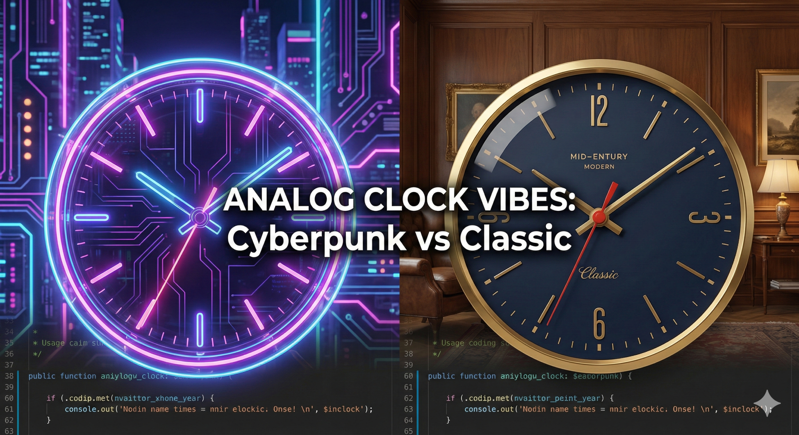
어제 만든 심플한 디지털 시계에 이어, 오늘은 블로그의 분위기를 단번에 바꿔줄 ‘엣지 있는 아날로그 시계’ 두 가지 버전을 준비했습니다.
첫 번째는 ‘사이버펑크 네온 글래스(Neon Glass)’ 입니다. 어두운 배경 위에서 은은하게 빛나는 형광 네온과 반투명한 유리 질감이 미래지향적인 힙한 감성을 자아냅니다.
두 번째는 정반대의 매력을 가진 ‘미드 센추리 모던(Mid-Century Modern)’ 스타일입니다. 묵직한 네이비 컬러와 섬세한 금속 골드 텍스처의 조화로, 마치 고급 서재나 호텔 로비에 걸린 듯한 클래식한 우아함을 선사합니다.
HTML 블록에 복사해 넣기만 하면 바로 작동하는 소스 코드를 공유합니다. 어느쪽이 더 취향에 맞나요?
사이버펑크 네온 글래스(Cyberpunk Neon Glass)’
12
3
6
9
코드
<!DOCTYPE html>
<html lang="ko">
<head>
<style>
  /* 시계 컨테이너: 워드프레스 내에서 중앙 정렬 및 배경 설정 */
  .neon-clock-wrapper {
    display: flex;
    justify-content: center;
    align-items: center;
    background: #0f0f12; /* 아주 어두운 배경 */
    padding: 50px;
    border-radius: 20px;
    font-family: 'Courier New', Courier, monospace;
  }

  /* 시계 본체: 유리 질감(Glassmorphism)과 네온 그림자 */
  .clock {
    width: 300px;
    height: 300px;
    background: rgba(255, 255, 255, 0.05);
    border-radius: 50%;
    border: 2px solid rgba(255, 255, 255, 0.1);
    box-shadow:
      0 0 20px rgba(0, 255, 255, 0.2),
      inset 0 0 20px rgba(0, 255, 255, 0.1);
    backdrop-filter: blur(15px);
    position: relative;
    display: flex;
    justify-content: center;
    align-items: center;
  }

  /* 시계 눈금 (엣지 포인트) */
  .clock::before {
    content: '';
    position: absolute;
    width: 90%;
    height: 90%;
    border-radius: 50%;
    border: 2px dashed rgba(0, 255, 255, 0.3); /* 사이버펑크 느낌의 점선 */
  }

  /* 바늘 공통 스타일 */
  .hand {
    position: absolute;
    bottom: 50%;
    left: 50%;
    transform-origin: bottom;
    border-radius: 10px;
    z-index: 10;
  }

  /* 시침: 묵직한 보라색 네온 */
  .hour {
    width: 6px;
    height: 70px;
    background: #bc13fe;
    box-shadow: 0 0 10px #bc13fe;
  }

  /* 분침: 밝은 민트색 네온 */
  .minute {
    width: 4px;
    height: 100px;
    background: #0ff;
    box-shadow: 0 0 10px #0ff;
  }

  /* 초침: 강렬한 핑크색 네온 + 스무스 무브먼트용 설정은 JS에서 제어 */
  .second {
    width: 2px;
    height: 120px;
    background: #ff0055;
    box-shadow: 0 0 15px #ff0055;
    z-index: 11;
  }

  /* 시계 중앙 포인트 */
  .center-point {
    position: absolute;
    width: 12px;
    height: 12px;
    background: #fff;
    border-radius: 50%;
    z-index: 12;
    box-shadow: 0 0 10px rgba(255, 255, 255, 0.8);
  }

  /* 12, 3, 6, 9 숫자 포인트 (옵션) */
  .marker {
    position: absolute;
    color: rgba(0, 255, 255, 0.8);
    font-size: 1.2rem;
    font-weight: bold;
    text-shadow: 0 0 5px rgba(0, 255, 255, 0.8);
  }
  .marker-12 { top: 20px; }
  .marker-3  { right: 25px; }
  .marker-6  { bottom: 20px; }
  .marker-9  { left: 25px; }

</style>
</head>
<body>

<div class="neon-clock-wrapper">
  <div class="clock">
    <div class="marker marker-12">12</div>
    <div class="marker marker-3">3</div>
    <div class="marker marker-6">6</div>
    <div class="marker marker-9">9</div>

    <div class="hand hour" id="hour-hand"></div>
    <div class="hand minute" id="minute-hand"></div>
    <div class="hand second" id="second-hand"></div>
    <div class="center-point"></div>
  </div>
</div>

<script>
  function setClock() {
    const now = new Date();

    const seconds = now.getSeconds();
    const secondsDegrees = ((seconds / 60) * 360);

    const minutes = now.getMinutes();
    const minutesDegrees = ((minutes / 60) * 360) + ((seconds/60)*6);

    const hours = now.getHours();
    const hoursDegrees = ((hours / 12) * 360) + ((minutes/60)*30);

    // 부드러운 움직임을 위해 transition 속성을 동적으로 관리하거나
    // 매 프레임 계산하는 방식 중, 여기서는 끊김 없는 CSS 회전을 적용합니다.
    document.getElementById('second-hand').style.transform = `translateX(-50%) rotate(${secondsDegrees}deg)`;
    document.getElementById('minute-hand').style.transform = `translateX(-50%) rotate(${minutesDegrees}deg)`;
    document.getElementById('hour-hand').style.transform = `translateX(-50%) rotate(${hoursDegrees}deg)`;
  }

  setInterval(setClock, 1000);
  setClock(); // 초기 실행
</script>

</body>
</html>
엣지 있는 네온 아날로그 시계
코드
<!DOCTYPE html>
<html lang="ko">
<head>
<style>
  /* 시계 컨테이너: 따뜻한 크림톤 배경으로 시계를 강조 */
  .luxury-clock-wrapper {
    display: flex;
    justify-content: center;
    align-items: center;
    background: #f4f1ea; /* 따뜻한 종이 질감 색상 */
    padding: 60px;
    border-radius: 20px;
    font-family: 'Helvetica Neue', Helvetica, Arial, sans-serif;
  }

  /* 시계 본체: 매트한 네이비 컬러와 금장 테두리 */
  .luxury-clock {
    width: 320px;
    height: 320px;
    background: #1a2a3a; /* Deep Navy */
    border-radius: 50%;
    /* 2중 테두리로 고급스러운 금속 프레임 느낌 구현 */
    border: 8px solid #c5a059; /* Gold Color */
    box-shadow:
      0 0 0 4px #1a2a3a inset, /* 내부 얇은 라인 */
      15px 15px 30px rgba(0,0,0,0.3), /* 리얼한 그림자 */
      -5px -5px 15px rgba(255,255,255,0.8); /* 반사광 */
    position: relative;
    display: flex;
    justify-content: center;
    align-items: center;
  }

  /* 시계 눈금 (인덱스): 금색 막대 */
  .dial-lines {
    position: absolute;
    width: 100%;
    height: 100%;
  }

  .dial-lines span {
    position: absolute;
    width: 2px;
    height: 15px;
    background: #c5a059; /* Gold */
    left: 50%;
    transform: translateX(-50%);
    transform-origin: 50% 160px; /* 시계 중심 기준 회전 (320px / 2) */
  }

  /* 12, 3, 6, 9시는 더 굵고 길게 강조 */
  .dial-lines span:nth-child(3n+1) { /* 12(0), 3, 6, 9에 해당 */
    width: 4px;
    height: 25px;
    background: #e0b86c; /* Lighter Gold */
  }

  /* 바늘 공통 스타일: 끝이 뾰족한 클래식한 형태 */
  .hand {
    position: absolute;
    bottom: 50%;
    left: 50%;
    transform-origin: bottom;
    border-radius: 50% 50% 0 0; /* 펜촉 모양 */
    z-index: 10;
    box-shadow: 2px 2px 4px rgba(0,0,0,0.4);
  }

  /* 시침: 짧고 굵은 골드 */
  .hour-hand {
    width: 8px;
    height: 80px;
    background: linear-gradient(to right, #bf953f, #fcf6ba, #b38728); /* 금속 질감 그라데이션 */
  }

  /* 분침: 길고 우아한 골드 */
  .minute-hand {
    width: 4px;
    height: 110px;
    background: linear-gradient(to right, #bf953f, #fcf6ba, #b38728);
  }

  /* 초침: 포인트가 되는 붉은색 (빈티지 감성) */
  .second-hand {
    width: 2px;
    height: 130px;
    background: #d64545; /* Vintage Red */
    transform-origin: bottom;
    z-index: 11;
  }

  /* 초침 뒤쪽 꼬리 (밸런스) */
  .second-hand::after {
    content: '';
    position: absolute;
    bottom: -20px;
    left: 50%;
    transform: translateX(-50%);
    width: 4px;
    height: 25px;
    background: #d64545;
    border-radius: 2px;
  }

  /* 중앙 캡: 금색 단추 */
  .center-cap {
    position: absolute;
    width: 16px;
    height: 16px;
    background: radial-gradient(circle at 30% 30%, #fcf6ba, #b38728);
    border-radius: 50%;
    z-index: 12;
    box-shadow: 1px 1px 3px rgba(0,0,0,0.5);
  }

</style>
</head>
<body>

<div class="luxury-clock-wrapper">
  <div class="luxury-clock">
    <div class="dial-lines" id="dials"></div>

    <div class="hand hour-hand" id="hour"></div>
    <div class="hand minute-hand" id="minute"></div>
    <div class="hand second-hand" id="second"></div>
    <div class="center-cap"></div>
  </div>
</div>

<script>
  // 눈금 자동 생성 (12개)
  const dialContainer = document.getElementById('dials');
  for (let i = 0; i < 12; i++) {
    const span = document.createElement('span');
    span.style.transform = `translateX(-50%) rotate(${i * 30}deg)`;
    dialContainer.appendChild(span);
  }

  function updateClock() {
    const now = new Date();

    const seconds = now.getSeconds();
    const minutes = now.getMinutes();
    const hours = now.getHours();

    const secondsDeg = (seconds / 60) * 360;
    const minutesDeg = (minutes / 60) * 360 + (seconds / 60) * 6;
    const hoursDeg = (hours / 12) * 360 + (minutes / 60) * 30;

    document.getElementById('second').style.transform = `translateX(-50%) rotate(${secondsDeg}deg)`;
    document.getElementById('minute').style.transform = `translateX(-50%) rotate(${minutesDeg}deg)`;
    document.getElementById('hour').style.transform = `translateX(-50%) rotate(${hoursDeg}deg)`;
  }

  setInterval(updateClock, 1000);
  updateClock();
</script>

</body>
</html>#워드프레스 #블로그꾸미기 #바이브코딩 #시계위젯 #웹디자인 #사이버펑크 #미드센추리모던 #HTML소스 #감성코딩 #홈페이지제작